Eden Photographers Club Meeting - Tuesday, June21st @ 7pm EDT

Contributor: Wondermom Wondermom
Quote:
Originally posted by Alys
There's a nice, crisp focus in this shot, but the real lack of highlights and shadows makes it difficult to focus on any one area of the photo.
I agree, I love the subject matter but there isn't the depth and shadowing I expect from a nature shot
06/21/2011
Contributor: Vaccinium Vaccinium
Quote:
Originally posted by Kake aka PoeticErotica
It seems a tad too warm but i really like the composition. i swear to god, though, i'm about to give up. i don't know jack - i just do it intuitively and if it works yay, if not, so be it.
No need to give up. There's no right way of doing this (or wrong way). If it works for you, that's great, but the reason I manage this club and put on these meetings in the first place is because there are things that everyone can take from them if they want. I haven't listened to everything I've been taught, but there are some things that have really helped me at the same time.
06/21/2011
Contributor: Ivy Wilde Ivy Wilde
I really like the way the log forms a diagonal from the bottom left to the top right. Really draws the eye across the photograph.

However, all the colors seem sort of the same. There is no real contrast. Nothing that really grabs your attention. Even the orange mushrooms sort of blend in.

Also the vertical tree trunks in the background sort of distract from the flow of the image. I would have cropped the top part of the image off to eliminate them.
06/21/2011
Contributor: Petite Valentine Petite Valentine
Quote:
Originally posted by Vaccinium
There are a number of ways you can critique. Personally, I feel most comfortable with giving an opening sentence or two about what I feel about the photo overall before looking at the nuances. Then, I ordinarily list the positives and negatives ... more
I like that the natural line that the leaves form, it leads the eye through the picture. But I find myself returning to the bottom corner because of the mushrooms. I'm also missing shadows.
06/21/2011
Contributor: Vaccinium Vaccinium
It's interesting. When you erad my critique, you'll see that we are seeing many of the same issues, but I'm looking at it from an opposite perspective.
06/21/2011
Contributor: Airen Wolf Airen Wolf
Quote:
Originally posted by Vaccinium
There are a number of ways you can critique. Personally, I feel most comfortable with giving an opening sentence or two about what I feel about the photo overall before looking at the nuances. Then, I ordinarily list the positives and negatives ... more
It seems sort of aimless but as I scroll up mimicing the cropping of the photograph I can see the picture taking shape as the mushrooms are allowed to take center stage. Still though they are too far to the left at least that's my perception.
06/21/2011
Contributor: Vaccinium Vaccinium
Most of you see the same thing I do, abeit in a different way – that there is interest in the foreground, but the background is jumbled and uninteresting. Here’s my critique of it:


I like the idea behind the photo, but there is really too much going on outside the foreground. The mushrooms and senescent leaves make a very attractive foreground, with the red of the mushrooms, the texture of the leaves, and the framing of the lush green moss making for a very eye-catching scene. The colors are wonderful and are perfectly vibrant. I also like the placement of the mushrooms in the bottom left of the photo and the line the log makes to the upper right corner (although the log is fairly indistinct and you have to work to get your eye to move along the length of it). Exposure is quite good, with everything within properly exposed.


However, once you get to that upper corner, there’s nothing there. There are some partially obscured trees against a light background, but that’s about it. The entire top half of the photo is very busy with trees, branches, and foliage, with nothing in particular to grab the eye. Perhaps choosing a much lower f-stop would have allowed the mushrooms, leaves, and moss to stand out more, with the background becoming softer and less detailed. This may have improved the image. So too might have been a tight crop that eliminated the top half of the photo. The photo is also a bit oversharpened and a little flat. Boosting the contrast just a bit might have helped.


Sometimes great ideas never quite work it reality. This was one of those photos. Any questions?
06/21/2011
Contributor: Kake aka PoeticErotica Kake aka PoeticErotica
Quote:
Originally posted by Vaccinium
No need to give up. There's no right way of doing this (or wrong way). If it works for you, that's great, but the reason I manage this club and put on these meetings in the first place is because there are things that everyone can take from ... more
I hear ya... I'm just used to, um, being a smartypants and i'm tired and grumpy and frustrated because I can't know EVERYTHING THIS INSTANT. Sorry for the brief temper-tantrum, folks.
06/21/2011
Contributor: sexyintexas sexyintexas
He better get me a camera or there will be issues lol.
06/21/2011
Contributor: Kake aka PoeticErotica Kake aka PoeticErotica
Quote:
Originally posted by sexyintexas
He better get me a camera or there will be issues lol.
Hahahaha, I was thinking the same thing. The bf is supposed to give me one for my bday next month. Lawl. Hi5!
06/21/2011
Contributor: sexyintexas sexyintexas
Quote:
Originally posted by Kake aka PoeticErotica
I hear ya... I'm just used to, um, being a smartypants and i'm tired and grumpy and frustrated because I can't know EVERYTHING THIS INSTANT. Sorry for the brief temper-tantrum, folks.
Lol, I have been having a tantrum for days.
06/21/2011
Contributor: Vaccinium Vaccinium
Quote:
Originally posted by sexyintexas
He better get me a camera or there will be issues lol.
Men can be oblivious (I speak from experience). Make sure your hints are obvious - *not* subtle.
06/21/2011
Contributor: sexyintexas sexyintexas
Quote:
Originally posted by Kake aka PoeticErotica
Hahahaha, I was thinking the same thing. The bf is supposed to give me one for my bday next month. Lawl. Hi5!
Haha what day is yours? Mine is the 23rd.
06/21/2011
Contributor: Kake aka PoeticErotica Kake aka PoeticErotica
Quote:
Originally posted by Kake aka PoeticErotica
Hahahaha, I was thinking the same thing. The bf is supposed to give me one for my bday next month. Lawl. Hi5!
That and a devine toychest in midnight black..... le sigh.
06/21/2011
Contributor: sexyintexas sexyintexas
Quote:
Originally posted by Vaccinium
Men can be oblivious (I speak from experience). Make sure your hints are obvious - *not* subtle.
I don't think I can get much clearer than "I want a camera for my birthday" Lmao!
06/21/2011
Contributor: Vaccinium Vaccinium
OK, since I'm running short on time....
06/21/2011
Contributor: Vaccinium Vaccinium
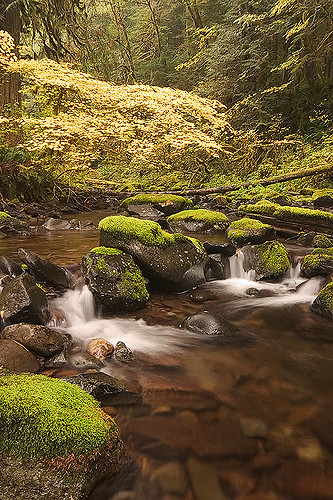
This photo really irritates me, frankly. It had the potential to be wonderful with a few minor changes. I can recreate it any autumn day I want, but I haven’t yet. Anyway, here is my critique:


There is a lot of potential with this shot, but three elements are particularly distracting. For one thing, the yellow of the maple tree overhanging the stream is blown out and looks as much white as it does yellow. A slightly lower exposure would have allowed the tree to be a warm yellow while not detracting from the rest of the image. Another other issue with the photo is the significant dead, negative space in the stream at the lower right of the photo. Perhaps shifting the camera position to the that moss-covered rock so that it takes up more of the bottom portion of the image would help in this regard. The final issue, albeit minor, is with the placement of the yellow of the vine maple. I’d like to see it raised a tad higher. A lower camera angle, cropping, or an increased zoom might accomplish that.


That said, the image is set up nicely, with the stream, moss-covered rocks, autumnal trees, and background evergreens filling the space nicely and evoke the gloomy, yet colorful autumn days of the Pacific Northwest. The long exposure also added a luxurious feel to the tumbling water, yet none of the foliage seems blurred. Depth of field is very good, as everything from the foreground to the farthest evergreens is acceptably in focus. Obvious use of a circular polarizer really helped the image a lot, as there are is no distracting glare off the water surface.


Keep in mind that, as I mentioned in that critique, sometimes the emotion, theme, or sensation that an image suggests is just as important as the compositional elements and technique. Photos are art, and art is supposed to draw you in and make you feel something. Not all photos need to do this with great intent or success, but some are clearly designed to do so, so make sure to mention it if it affects you.
]
06/21/2011
Contributor: Kake aka PoeticErotica Kake aka PoeticErotica
Quote:
Originally posted by sexyintexas
Haha what day is yours? Mine is the 23rd.
26th! LMAO!
06/21/2011
Contributor: Wondermom Wondermom
Quote:
Originally posted by Vaccinium
Men can be oblivious (I speak from experience). Make sure your hints are obvious - *not* subtle.
I'm just buying my own lol
06/21/2011
Contributor: sexyintexas sexyintexas
Quote:
Originally posted by Kake aka PoeticErotica
That and a devine toychest in midnight black..... le sigh.
Ooh I have the pink with black trim....it holds soooo much
06/21/2011
Contributor: Vaccinium Vaccinium
Aaaah. No photo! Gimme a minute.
06/21/2011
Contributor: Kake aka PoeticErotica Kake aka PoeticErotica
Quote:
Originally posted by Vaccinium
Men can be oblivious (I speak from experience). Make sure your hints are obvious - *not* subtle.
I'm NEVER subtle, especially not about presents.
06/21/2011
Contributor: Vaccinium Vaccinium
Crap. I went out of sequence.
06/21/2011
Contributor: sexyintexas sexyintexas
Quote:
Originally posted by Kake aka PoeticErotica
I'm NEVER subtle, especially not about presents.
Neither am I, Its the Leo
06/21/2011
Contributor: Vaccinium Vaccinium
Anyway...

I hope all of you are not only learning how to critique through this tutorial. Just as important is that you are getting an idea how to look at a photo, see what worked and what didn’t, and use that information for the next time you get out doing photography. Not only can you learn from your mistakes and accomplishments, but from those of others too.


Here is one final photo:


Chinook Creek, Gifford Pinchot National Forest


Photo by Vaccinium. f/11, 1 sec., ISO 100, Color temperature: 7500, Sigma 12-24 mm lens at 19 mm on Canon 10D camera body, from tripod under tree canopy and overcast skies, optimized sharpness, color, and contrast using Adobe Photoshop CS2


Anything that stands out to you as being particularly good or particularly distracting?
06/21/2011
Contributor: Kake aka PoeticErotica Kake aka PoeticErotica
Quote:
Originally posted by sexyintexas
I don't think I can get much clearer than "I want a camera for my birthday" Lmao!
You can do like I do and give him the brand and model number and call the closest locatiion to make sure it's in stock. *facepalms*
06/21/2011
Contributor: Ivy Wilde Ivy Wilde
Quote:
Originally posted by Kake aka PoeticErotica
I'm NEVER subtle, especially not about presents.
Nor am I. I usually give him a link to the EXACT item that I want.
06/21/2011
Contributor: Wondermom Wondermom
Quote:
Originally posted by sexyintexas
Neither am I, Its the Leo
my bday is this weekend, the ever emotional cancer
06/21/2011
Contributor: Kake aka PoeticErotica Kake aka PoeticErotica
love love love the colors but i think the top could be cropped a bit lower
06/21/2011